By Living Room Realty, June 29, 2023
For sure, curb appeal is a thing—it’s a real, big thing. It’s can lure interest in a home with a head snap and a heart flutter—or immediately shut down any love connection, crash-and-burn style. There are a number of factors that go into creating curb appeal and house color is definitely toward the top of that list.
Choosing the ‘right’ paint color is hard, even for an interior designer like myself—anyone who says differently, well, I’m jealous (and a little dubious). I daresay that rare is the occasion that someone floats into the paint store, picks out a single color they like, goes home and paints the requisite 2’x2’ swath in a minimum of two coats on multiple sides of the home and it works perfectly. Pretty sure that’s never happened.
Paint can be fussy and perform differently depending on which direction the home faces, the surface you’re painting on, time of day, quality of the paint, and the quality of the paint job. These are just some of the factors to consider and here are a few more:
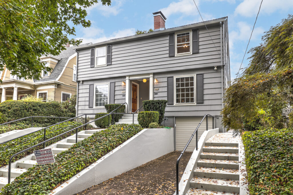
- The home’s vintage, style, and location. Certain paint brands have period-specific paint lines. For example, Benjamin Moore’s Historical Color Collection consists of colors relevant to American homes during the turn of the century. No need to break your back searching for the perfect blue for your Craftsman four square—Ben has narrowed it down for you! Likewise, paint colors often hold geographical clues in their names that suggest where they might best be used. For example, ‘Caribbean Coral’ would likely not be appropriate for a cottage in the British countryside. This is helpful!
- The colors of the surrounding homes. It’s pleasant when there is color cohesion in a neighborhood. This doesn’t mean that every home should be the same color, of course, just complimentary to the ones around it.
- The exterior should reflect the interior. What I mean by this is that the exterior and the interior should relate to each other. If you don’t style with pastel colors in your interior, maybe pale lavender isn’t the right color for your front door? It’d be a mismatch, right?
- Choose several sample options. Learn what appeals to you (and equally as important, what doesn’t) by browsing magazines, books, and Pinterest and walking your neighborhood. Having a baseline idea will help when you then visit your favorite paint store and select a minimum of three colors that excite you. (Engage with the professional staff there—they are a wealth of knowledge and experience!) Go home and paint your samples in large swaths (2’x2’ is great!), side by side, on at least two sides of your home (ideally all sides though). Let it simmer for several days, checking in on your color babies at different times of the day, taking note how different each can appear at those times. If there are no winners, or you’re just not sure, revisit your Favorite Paint Store and try again.
- Don’t forget about trim, sashes, siding, and doors. The natural tones in stone, brick, and cedar shake siding can really affect how paint appears, so being sure to paint your samples next to these elements is crucial. Same goes for window trim and doors as you want to ensure a love match between the base color of your home and these accent pieces. A sash color that contrasts with the window trim can really make your windows stand out and a pop of color on your door can be a low commitment way to express your personality.
- Accessorize with flowers, plants, pots, and furniture. Once you’ve nailed your perfect color scheme, the fun part of accessorizing is next. Select furniture that is proportionate to the size of your porch/stoop/cement landing and, of course, pairs well with your new home color. Placing pots with different height and colored plants/flowers/shrubbery around doors and windows will accentuate the beautiful new paint scheme you’ve worked so hard at. Just like with choosing paint, it may take a few tries to get everything to feel like it gels—enjoy the process and play!

Now is a great time to get on that exterior painting project if you live in a part of the country that has greater spans of drier weather. Do your research and ask me or neighbors who they would recommend and interview several painters. It’s truly worth it to invest the time and effort in selecting your paint professional and the color(s) you choose for your home. You want to love your selection for years to come!